

Healthcare apps are supposed to make life easier, right? Especially for older adults, who stand to benefit the most from these solutions. Yet many apps appear designed without considering the needs of senior users.
Unreadable text, missing instructions, overreliance on gestures, and other UX speed bumps are probably among the reasons why 62% of adults aged 65–80 have never used a health app. And 69% of adults aged 65+ say technology is not designed with their age in mind.
But here's the thing: by overlooking users over 65 today, you ignore a massive demographic of 830 million people. You can still tap into this market by making your apps more inclusive for older users. The Orangesoft team has 15 years of experience in healthcare technology development, and we’ve curated our best practices and tips on UX design for seniors.
Age-related challenges in the UX of healthcare applications for seniors
When it comes to UX design for seniors, it’s important not to base your hypotheses on common assumptions that older generations are inherently bad with technology. They may be, or they may not. Your starting point for UX design should be certain physiological and cognitive changes associated with aging that need to be compensated for.
Physical limitations
As people age, so do our bodies. The natural aging process, in turn, impacts how older people interact with emerging technologies.
Visual impairments
Many seniors experience a gradual decline in visual acuity, which affects how well they can see finer details and colors. For example, while younger users see colors with short wavelengths, such as blue, older users often see them as faded due to natural yellowing of the eye's lens. Glaucoma, dry eyes, cataracts, and age-related macular degeneration can also exacerbate visibility.
Motor skills decline
In later life, elderly people might notice that it's harder for them to interact with small buttons or closely spaced interface elements because motor performance tends to decline with age. Reduced dexterity, hand tremors, weaker muscles, gait changes, and other changes are common for older users, causing limited touchscreen skills and reduced mouse accuracy.
This can lead to an older adult struggling to tap a tiny "refill prescription" button or accidentally selecting the wrong medication due to buttons being too close together.
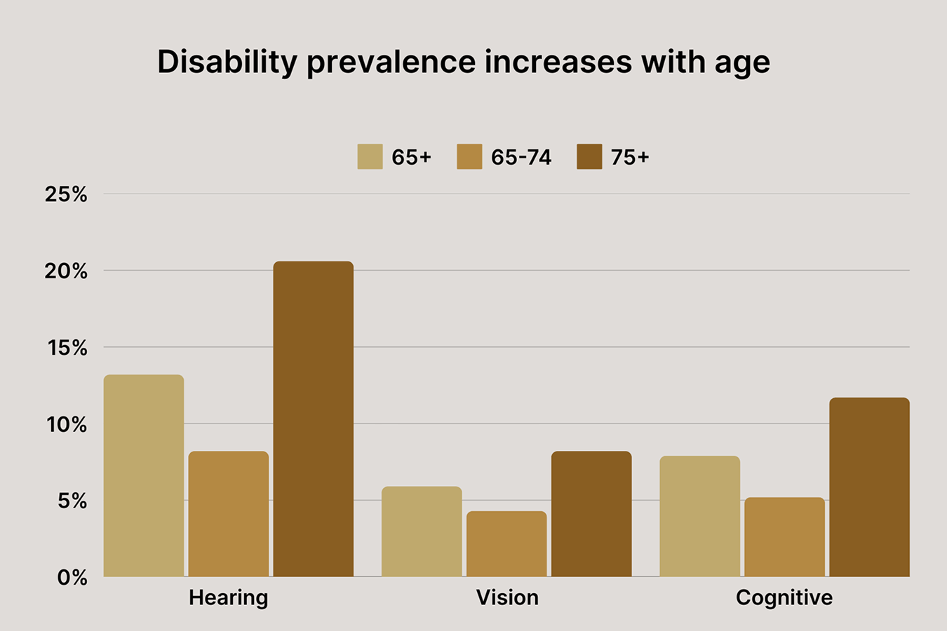
Hearing loss
About 1 in 3 adults aged 65 to 74 have hearing loss. Adults in this age group may struggle with auditory feedback, such as app alerts, alarms, voice prompts, and sound cues. That’s why inclusive healthcare applications should never rely on a single mode of presentation; they should also provide visual cues or alternative feedback methods to accommodate this user group.
Cognitive challenges
Cognitive changes are a common part of aging. Forgetfulness, shrinking attention span, reduced brain flexibility, decline in working memory, and other common cognitive challenges can make it harder for seniors to find their way around healthcare apps.
Plus, older adults may not be familiar with common visual conventions in app design, such as icons, hidden menus, or pitch-to-zoom. This lack of background, combined with cognitive challenges, can create a significant learning barrier for older healthcare app users and cause tech anxiety.
Trust and motivation issues
Seniors often hesitate to adopt emerging technologies due to trust concerns and motivation barriers. Although this notion is not necessarily related to cognitive abilities, inherent skepticism and pushback on new technologies are important factors to consider when designing for seniors. Focus on security, and the tangible value of your healthcare product should be among the overarching objectives of your user interface design.
Best practices for designing digital experiences for older adults
Web Content Accessibility Guidelines (WCAG) are a strong starting point for inclusive design, addressing the general needs of seniors. However, these standards do not factor in the specific age-related challenges we’ve mentioned above and do not account for a specific setting in which seniors use technology.
That’s why we recommend taking a more holistic approach that, based on the nature of your app, places senior users either at the center of UX or on par with other user groups. Remember that accessible design is equally accessible on web and mobile interfaces.
Intuitive and minimalist visual design
At its core, age-friendly, user-centered design is just "simple" design with effective, straightforward visual elements and interfaces that benefit all healthcare app users, not just seniors. The only difference is that apps geared toward the aging population are more intentionally and rigorously designed to place design simplicity and clarity at the center.
Here are general recommendations:
- Use large, readable fonts (16 pt+ for body text), especially for critical information such as dosage and timing.
- Avoid multiple font families and condensed font styles to improve readability. Examples of age-friendly fonts include Arial, Helvetica, Century Gothic, Serif, Times, Bookman, and Book Antigua.
- Use high-contrast colors (black text on white backgrounds works best) and keep backgrounds clean. Using a color contrast checker, you can determine if your interface meets the WCAG AA and AAA guidelines.
- Add descriptive labels to icons to clarify their meaning.
- Avoid text overlaid on images or graphics to enhance readability.
- Establish a clear visual hierarchy to emphasize important interface elements and information. You can use variations in type weight to make a clear hierarchy (bold and regular), but choose bold over italics for emphasis.
- Use redundant cues such as text labels, symbols, icons, auditory signals, etc. to convey a message (e.g., you can combine color-coded health status indicators with text labels such as “Needs attention” and icons such as an exclamation point for "Warning”).
- Adding a night mode that switches to black and white in low light conditions to optimize readability.
Simple and clear navigation
Tech-savvy younger adults aged 20 to 40 readily grasp visual cues and have a more intuitive understanding of common UI interactions, such as swiping and dragging. Older adults perceive information a bit differently, being more comfortable with text-based cues, while visual-heavy interfaces can confuse older users and maximize the cognitive load.
Here’s how you can address these differences:
- Provide a clear home screen with main features easily accessible.
- Simplify and increase the size of interactive controls and distance between them (at least 48px in height) to avoid accidental tapping (e.g., large, easily tappable/clickable buttons).
- Ensure back and home buttons are on at all times (or signpost a route back to the home page) and add a clickable link that says "Back" in addition to the browser's built-in "Back" button.
- Allow for swipe alternatives (e.g., back buttons instead of only gestures).
- Offer a consistent layout and navigation patterns throughout the app.
- Avoid using more than two levels of submenus.
- Use progress indicators for multi-step processes.
- Ensure all buttons and links have clear, easy-to-understand labels.
Accessible design principles
Not all disabilities are age-related. Many people, regardless of their age, experience disabilities from birth or due to other factors. That’s why, in addition to age-friendly features, healthcare apps should also have baseline accessibility features that both create an inclusive environment for everyone and optimize the app for the unique needs of older adults
- Implement voice commands and text-to-speech options
- Enable screen readers and adaptive text sizing
- Include subtitles for video and audio content
- Enable full keyboard navigation for users who cannot use a mouse due to motor impairments
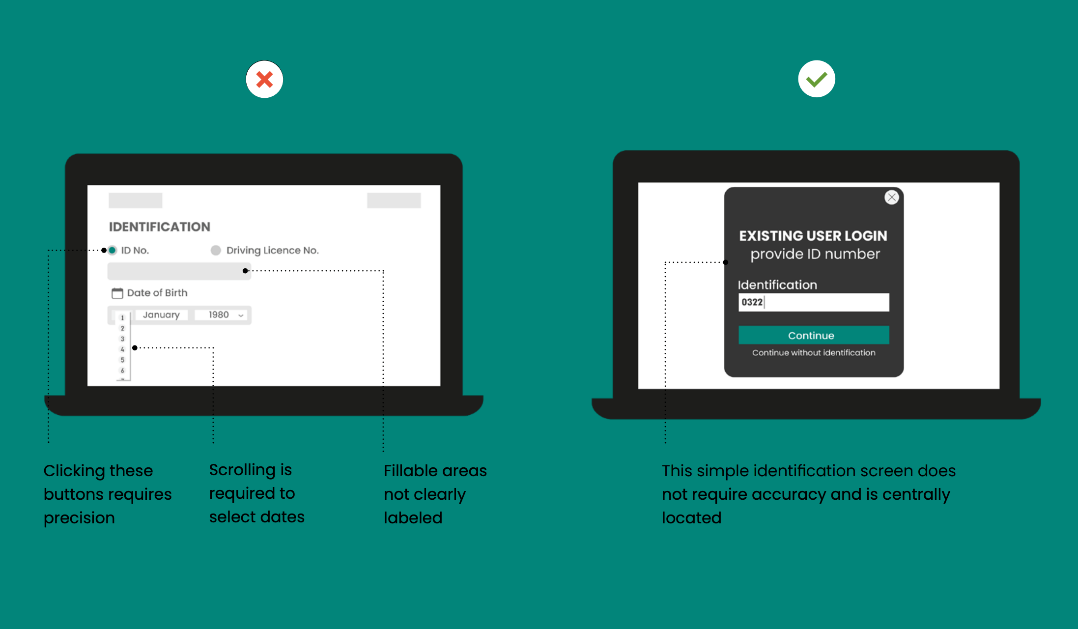
Easy authentication
The shift to online services, healthcare ones included, comes at the cost of reduced control over protected information — and widely reported data breaches heighten anxiety among the less technically-proficient.
So the real challenge for your healthcare app is to maintain a delicate balance between demonstrating a security-first approach and having easy authentication mechanisms.
- Enable biometric logins such as fingerprint scanning with fallbacks in case potential issues with dry skin or arthritis affect fingerprint quality. Face recognition is also a go-to option, but make sure it works reliably in varying lighting conditions and with reading glasses.
- Allow for simple PIN/passcode-based authentication, but make sure the on-screen keypad is large enough, and provide audio cues when keys are pressed.
- Offer password recovery options that don’t rely on complex email interactions such as SMS, KBA, or recovery phrases.
Clear feedback and error handling
Many healthcare apps are unforgiving of errors. For example, when a user types in the date of birth in the wrong format — DD/MM/YYYY instead of MM/DD/YYYY — the app rejects the input, displaying something cryptic like "Invalid date format."
A well-designed, age-friendly error state not only displays the error message but also offers clear guidance on how to resolve the issue. Ideally, the app should allow for a wide range of interactions, allowing senior users to enter data in a way that feels natural to them.
Here are the best practices in terms of feedback and error states:
- Follow each important action with a clear confirmation message (e.g., "Your refill request has been submitted").
- Offer visual feedback on the progress of tasks (e.g., a loading bar).
- Place error messages above the input and implement visual cues like color, icons, and placement to point out errors.
- Opt for simple, self-explanatory error messages, e.g., “Please enter a 10-digit phone number, including the area code” instead of “Invalid input”. Highlight the next steps when an error occurs.
- Implement multimodal feedback, where possible, including video or audio content, visual feedback, etc.
- Increase response time, time for feedback information, and time-outs.
- Avoid disappearing messages, make messages manually dismissible.
Engagement strategies
Similar to the decline in physiological functions, motivation fizzes with age. For a healthcare app, it means that its design must make up for the potential challenges (from onboarding onward) that older users might experience in adhering to the app and interacting with it daily.
Here’s how your design can reinforce the get-up-and-go attitude in senior users:
- Ensure a stress-free start with a personalized, step-by-step onboarding flow that introduces product features gradually, at a comfortable pace for senior users. You can precede the onboarding process with an initial assessment or profile creation to understand the tech-savviness level and health needs of the user.
- Make sure the health benefits and outcomes your app helps achieve are communicated loudly and clearly during onboarding.
- Spell out privacy policies and data security measures to reassure senior users that their sensitive health information is safe with your app.
- Enable multimodal reminders for medication adherence, health tracking, and personalized feedback to keep users coming back to your app.
- Leverage peer support features and community forums to foster a sense of purpose and belonging among senior users.
- Incorporate unobtrusive, non-patronizing gamified elements to enhance the user experience (e.g., medication adherence streaks and focus on personal progress).
Content and language
When you’re designing for older adults, it’s not just your layout that should be minimalistic. You should also cut the fluff from the app content and keep the content presentation to a necessary minimum.
In healthcare apps, this minimalistic approach includes:
- Supplementing app interactions with short, direct instructions that are free of medical and tech jargon (e.g., “Schedule appointment” instead of “Access the appointment scheduling module”)
- Making sure your interfaces are supportive and encouraging, with no condescending tone
- Putting important information on a sharp display
- Displaying the most relevant metrics for your users’ conditions (e.g, users do not expect a diabetes management app to show detailed sleep stage analysis)
- Adopting simple, common chart types to visualize historical data — such as bar charts, line graphs, and pie charts.
Emergency and support
Healthcare applications are usually equipped with alert systems and emergency call functionalities so that seniors can quickly notify caregivers or emergency services. With the high stakes involved, it’s essential to make these functionalities easily discoverable and accessible for all users, regardless of their age or specific health needs.
Consider implementing the following design elements to make sure your app can help in case of an emergency:
- Placing emergency contact information right on the app's main screens.
- Including a one-tap/-click dedicated "Emergency" or "SOS" button in the app.
- Including a help section with FAQs, basic troubleshooting steps, and a search bar in the app.
- Allowing the user to connect with a nurse hotline or their doctor's office with a one-click/-tap the “Call for help” button.
- Making the “Medical ID” section with the user’s vital information accessible from the main screen.
Age-friendly design starts with age-friendly research and testing
We often see healthcare companies falling into the same trap of putting age-friendly features on the back burner. They launch the product and then decide to bolt on the accessibility features when the product is already up and running, which leads to costly reworks and, sometimes, full product overhauls. Here’s how you can sidestep this mistake and make sure your app is truly accessible.
Include older users in user research and early testing
Most companies equate accessible design with a checklist of specific features and lofty requirements. However, age-aware design starts with developing a deep understanding of your target audience and their specific use cases. These two variables are what dictate the default features and functionalities of your healthcare app.
The best way to tap into the minds of senior users is to make them a part of your design research. This way, your design team doesn’t follow a hunch but acts on the real, first-hand data. Later, your designers can test their hypotheses with the same group of seniors, ensuring that the final design decisions meet the mark.
Keep in mind that older people are not a homogeneous group. The rate and extent of age-related changes are different across different age brackets. Age-related conditions can vary, too. So make sure to include different demographics in your analysis to explore how specific design decisions impact each group individually.
Test under various conditions
You never know when, where, and under what circumstances your users might need the app. That’s why you need to ensure that all design elements are easily findable, pressable, and understandable under various real-world scenarios. You can do that by testing the app under varied lighting, movement, and dexterity conditions.
Gather feedback from caregivers
Caregivers are heavily involved in a senior's healthcare, and they often see firsthand the specific challenges seniors encounter when navigating a healthcare app or a website. You can pick their brains to spot potential stumbling blocks in your app or better understand how the app integrates (or doesn't integrate) with their caregiving workflow.
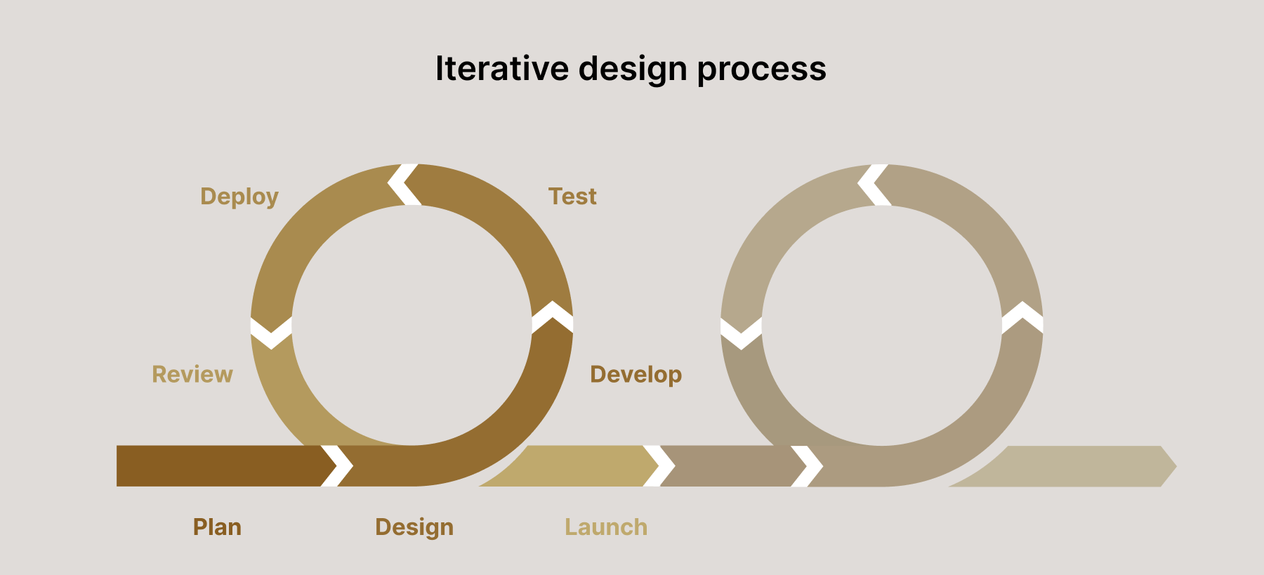
Iterative and user-driven approach to design
Inclusive user experience shouldn’t be a phase in the app development process or something subtracted from the full-fledged experience. Age-friendly design should be a continuous, iterative cycle where each iteration is tested with user research. This iterative loop promotes continuous refinement and makes sure your application is designed with the end user in mind.
Orangesoft’s experience in designing inclusive user experiences for healthcare products
Here’s one thing we’re positive about at Orangesoft: good accessibility is good for everyone. It’s more about refining the core experience than screwing on age-specific features later in the development process. We adhere to this principle in every healthcare project, including the one where our team was in charge of developing a patient portal dedicated to prescription refills for one of our healthcare clients.
Although the platform’s target audience isn’t limited to the older audience only, our team made sure to include a representative group of seniors with varying levels of tech experience and physical or cognitive limitations in design research.
Following the obtained insights, our design team implemented the following elements:
- A clear, uncluttered menu structure with descriptive labels such as "Refills," "Medications," and "Messages".
- Additional visual cues, such as icons, underlines, and labels for all navigation items, fields, error indicators, and medication lists.
- Multimodal notification methods, including audible alerts, text messages, and in-app notifications.
- Compatibility with screen readers and with browser zoom and screen magnification tools.
- Voice commands for navigation and data entry, keyboard navigation (the portal is fully navigable using a keyboard), and more.
The above UX and UI design elements helped the client expand the patient base to new demographics and enable senior users to order refills from the comfort of their homes, which is especially important for this user group. The positive feedback from senior users also positioned the client as a patient-centered provider that meets the diverse needs of its patient population.
Age-inclusive design is not about age
Whether you’re developing a healthcare solution to specifically fit the needs of older adults or do the job for a wider audience, universal design makes your solution a better place for everyone. Senior-friendly design doesn’t mean you need separate products for each user group. It’s more about raising the design bar for all products.
To make sure your design is developed with the needs of all user groups in mind, you need to bring older adults, among other user groups, into your design process and build off their needs right from the start. This not only benefits the older audience but also improves the overall UX for everyone, making your healthcare app successful among all age groups.