
With around 2.16 million applications available on Google Play and 2.13 million apps in the App Store, users have an abundance of apps to choose from. App owners, however, have got the short end of the stick and may suffer from such stiff competition.
To gain the users' attention and win a larger market share, a business should make every single detail of its app perfect. App icons play a vital role in attracting new users and making them download your application. A distinctive, memorable mobile app icon helps your app stand out from the competition, increasing conversion and boosting brand awareness.
As a mobile app development company with 15 years of experience, Orangesoft has helped companies develop over 300 applications. In this article, our UI/UX design team shares time-tested tips and tricks on how to develop an irresistible app icon that cuts through the noise and achieves icon-ic success.
Don't underestimate the power of a good app icon
Although it may seem insignificant initially, an app icon plays a crucial role in ensuring the growth of your digital product.
It hooks the user
When a user comes across your app on the app store, the app icon will be the visual gateway that leads them to your product. While app features do matter, a user may never discover them if the app doesn't have an appealing cover. Conversely, a well-designed app icon can pique users' interest and encourage them to explore your product.
It promotes the app
A clear, good-looking app icon can boost conversion rates by up to 25% for finance apps. The same goes for other app categories. In a competitive landscape such as app stores, you should capitalize on every opportunity to make it to the top of the heap. Also, search algorithms consider app icons a ranking factor, making them a high-impact component in app store optimization (ASO).
It improves app downloads and engagement
Google Play Store and Apple App Store combined drove approximately 34 billion app downloads per quarter in 2024. A memorable app icon that reflects the purpose and unique personality of your product can increase your chances of capturing a portion of the massive app market and enticing users to make room for your app on their devices. Once placed on the home screen, this tiny piece of branding also encourages the user to click on your app and engage with your content.
It reinforces your brand identity
A memorable, consistent app icon serves as a brand ambassador, connecting your digital product with your company's messaging and values. A consistent icon across all platforms bolsters brand recognition and helps users associate your app with your brand.
A step-by-step guide to designing custom icons
Creating an icon design that breaks the mold requires a lot of preparatory work. Despite the icon's apparent simplicity, you still need the chops to pack powerful visuals into such a small space. Here's how to make an app icon that turns views into downloads.
Step 1. Shape the concept
A successful app design requires a solid foundation built on your target audience's expectations, your app's specifics, market trends, and a dash of creativity. So, to polish your concept, make sure to:
- Focus on your audience. For an icon to work as a marketing tool that drives downloads, it should resonate with your target users on a visceral level. This requires careful consideration of the icon's color schemes, patterns, and overall mobile app design.
- Research your niche. Analyze competitors' app icon designs to see how your idea stacks up against the competition. Don't forget to add your unique perspective to the overall trends to create a truly distinctive visual asset.
- Be authentic. Although you should peer into your competitors' apps, make sure your app icon doesn't copy theirs. A lack of originality can damage your brand's reputation, confuse users, and alienate potential customers.
- Align the app icon with the app's purpose. Your app icon should be a metaphor for your digital product. To create an icon that clearly represents your product, start by compiling a list of descriptive keywords and brainstorming their visual representation. These symbols can pave the way for creating app icons.
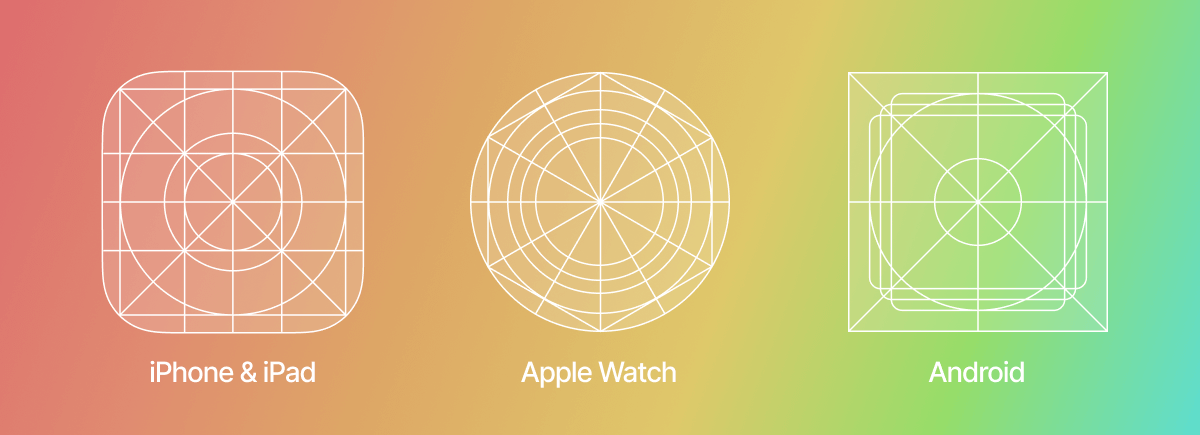
Step 2. Align your app icon design with platform guidelines
Besides being unique, appealing, and descriptive, your app icon design must also meet the requirements of the target platform to appear correctly in the app store. Both iOS and Android have worked out a specific set of rules about patterns, style, and layouts your app icon should stick with. You can find guidelines for an Android app icon here, and you can click this link to review iOS's interface guidelines. Below, we've created a summary of the key differences between the two app stores:
| Google Play Store (Android) | App Store (iOS) | |
|---|---|---|
| Dimensions | 512px × 512px | iPhone: 180px × 180px (60pt × 60pt @3x), 120px × 120px (60pt × 60pt @2x) iPad Pro: 167px × 167px (83,5pt × 83,5pt @2x) iPad, iPad mini: 152px × 152px (76pt × 76pt @2x) App Store: 1024px × 1024px (1024pt × 1024pt @1x) |
| Format | 32-bit PNG | PNG |
| Color mode | sRGB | sRGB or P3 |
| Shape | Square - Google Play automatically rounds off corners (20% of icon size) and adds shadows | Square without shadows or rounded corners |
However, the differing guidelines don't mean that you have to create custom icons for each OS. You can develop one icon design and adjust it to multiple platforms to save time, money, and effort.
Step 3. Design your app icon
The real estate on your users’ phones is limited, so you need an app icon that not only aligns with the platform guidelines but also checks all the boxes in terms of user experience. Here are some tips to get your app icon design right:
Ensure consistency
The icon represents the app in multiple places, including app stores and home screens. As the icon's size can vary widely, you need to ensure that it retains its visual appeal across different screen sizes.
While some visual details may be lost in translation, the core message and original concept of your app icon should remain intact, regardless of the platform.
Keep details to a minimum
When it comes to icon design, simplicity and symbolism trump fancy. The best way to achieve straightforward symbolism is to minimize the number of details used in the icon design. We recommend choosing one symbolic element and making it central to the icon's final design. Such a design minimizes confusion among the users and makes it easier to understand the unique value of your application.
Be unique and recognizable
Riding the wave of design trends is important, but creating your very own app icon that emerges from the pack is even more so. A unique icon is not only recognizable, but it also fosters an emotional connection with your users.
Moreover, uniqueness can turn into a competitive advantage. To become a cut above the rest, avoid rehashing generic patterns and colors that other developers have used thousands of times before you.
Choose the color palette carefully
Needless to say, colors affect the overall perception of an app icon. Colors can speak volumes and tap into the human subconscious. Here are three rules to follow when considering your icon's color palette:
- Make a statement. Colors tell their own story, so the choice of a color scheme is essential to the icon design. The right color can make your icon stand out, while the wrong color combination can turn the users away. To make the right call, you can consider best practices from leading brands. For example, the majority of leading brands' icons are blue, followed by red, and then white. But keep in mind that two contrasting colors are enough to create a visually striking icon.
- Align the colors with your brand's identity. The icon's color palette should represent your brand, so make sure to keep it consistent with your brand's overall visual identity, including your logo, website, and marketing materials.
- Leverage color psychology. Research how different colors can impact human behavior to make sure your color palette evokes the right response. For example, blue is often associated with trust and reliability, while green can suggest energy and youth.
- Keep aesthetics in mind. While vibrant colors can be eye-catching, avoid using too many colors, as they can make your app icon look cluttered or overwhelming. Also, the colors should blend seamlessly into phone backgrounds. Some app developers offer a selection of alternate app icons in the app's settings so users can choose one that matches their home screen.
- Consider the global context. Be mindful of cultural connotations associated with different colors. For example, red is considered the luckiest color in China, whereas in Western cultures it can symbolize danger or anger.
Choose symbols over text
While text can be used sparingly in app icons, visual symbols are a preferred option for representing your product. If you do include text, keep it minimal, as excessive text can hurt the icon’s readability. You can, for example, include a mnemonic, like the first letter of the app's name. For example, Skype uses a stylized “S,” while Facebook uses an “F” in its app icon.
Be informative
An effective icon is one that speaks volumes. In other words, it should be effective at setting the context for the functionality of your application.
For example, finance mobile apps often incorporate money symbols, charts, and vaults to directly represent the app's financial nature. Healthcare applications are known to feature hearts and medical items in their icon designs.
Although these descriptive symbols are quite generic, they are easy for a user to grasp. If you embed an overly complex symbol, you risk confusing users and, therefore, ruining your chances of establishing a connection.
Step 4. Run tests
It's impossible to make informed design decisions without collecting real user feedback first. That's why developers usually create a few icon designs and then test them. App icon testing includes the following activities:
Running a focus group test
A/B testing is the most widely used approach for testing icons. When you A/B test your app icons, you need to present two design options to two separate focus groups that represent your target audience.
During testing, these groups complete an opinion poll to provide feedback on whether the icon aligns with your app's brand and overall aesthetic. Along with the two design options, you can also include a few competitors' designs in the test for comparison.
To conduct A/B testing, you can use common tools such as Google Experiments for Android or Facebook A/B tests for iOS.
If, however, you run out of budget, you can turn to a more affordable method. Instead of focus groups, you can collect feedback from your friends, employees, and family.
Conducting a technical test
To perform a technical test, you need:
- Real devices to see how the icon performs on various screens
- Several differently-sized icons to verify the icon's integrity at any size
After testing, you won't have to guess whether your app's icon is successful or not. You will have definitive data to inform your app icon design.
What tools can you use to create an icon?
Here is a rundown of the most popular tools that you can use to create a perfect app icon:
Graphic editors or design applications
Those with experience using graphics editors such as Adobe Photoshop or Adobe Illustrator can create an icon using dedicated software. Professional design tools offer extensive functionality for app icon design, allowing you to create memorable visuals from scratch. Alternatively, you can use design applications such as Sketch or Figma to access similar functionality in a more streamlined interface.
Online tools
If you lack a design background, you can choose a simpler path and design visual assets with the help of an app icon generator that offers a more user-friendly approach to creating app icons. Online services such as Canva, Appicon, Looka, Iconsflow, and Font Awesome provide a variety of templates and intuitive interfaces.
It's the little things that turn browsers into loyal users
App icons are an integral part of a brand's identity and the first touchpoint between your app and a user. They are an ideal tool to present your functionality and convey your brand's message even before users click on your application. By creating a winning combination of color, symbolism, simplicity, uniqueness, and consistency, you can create an app icon that captures the attention of the target audience, drives downloads, and keeps users glued to your product.