Creating a mobile app from scratch may seem daunting, with millions of technical responsibilities, iterations, and twists. And it can be, but it doesn’t have to be. A consistent app design process will spare your nerves and put the app development pipeline on the right track.
A thought-out mobile app design process also dramatically affects your app's user experience. According to Toptal, 90% of app users have stopped using an app due to poor performance. Therefore, a user-friendly and sleek mobile design is paramount for a successful app and positive ROI.
But what does it take to craft a winning design? And what does a basic app design process look like? Let's find out.
A short primer on the mobile app design process
Mobile application design commonly refers to the external interface of the mobile solution that users interact with. However, app design isn't just a mere line-up of pretty visuals, buttons, and other user interface elements.
The overriding objective of mobile design is to make the product both easy to use and aesthetically pleasing. Designers, with their hands-on knowledge in user-centered design, are at the forefront of ensuring the app's flow and structure prioritize end-user needs.
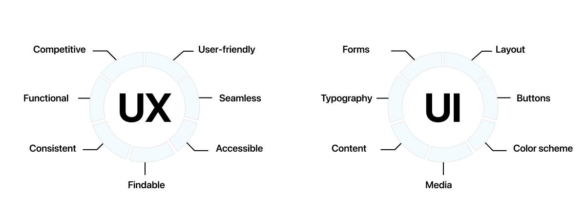
Great application design hinges on two core elements: UX design and interface design. While they both contribute to the same product, each addresses a different design challenge.
What is UX design?
UX (user experience) is a design strategy that focuses on satisfying the user's needs in the best way possible. The main goal of UX specialists is to ensure that the app meets user expectations and provides users with value. The main pillars of a successful UX design are good usability, accessibility, reliability, and usefulness.
The primary responsibilities of UX professionals may include, but are not limited to:
- Performing user research;
- Creating user personas;
- Identifying the information architecture of an application;
- Designing user flows and wireframes;
- Creating prototypes;
- Conducting user testing.
What is UI design?
UI (user interface) focuses on creating an application's digital appearance, including color schemes, buttons, labels, animations, transitions, and other visual elements. Essentially, UI is the process of building graphical interfaces with a focus on looks or style.
A typical set of tasks for UI designers can include:
- Transforming requirements into style guides and attractive interfaces;
- Identifying design problems and finding effective solutions;
- Creating animations;
- Choosing fonts and color palettes;
- Designing UI elements like scrollbars and icons.
As you can see, UI and UX are the two sides of the same coin, as both lead to a better product experience. Therefore, it is essential to pay due diligence to each during the design process.

Now that you know the fundamentals, let’s go over the main app design process steps for building a mobile solution.
How to design a mobile app: 10 crucial steps
The average app retention rate starts at 25.3% on day 1 and drops to 5.7% by day 30. An engaging app design, paired with an enjoyable user experience, creates a positive association with the product, encouraging users to return. Below, we've curated ten steps to help you design a conversion-worthy, retention-friendly app.
Set clear goals
Any software development process should be preceded by thorough pre-planning. Therefore, before designing a digital product, you should thoroughly analyze your app idea. At this stage, a design team will work closely with other software specialists and clients to evaluate goals, pain points, and competencies.
The planning stage can be further divided into the following milestones.
Stakeholder interview
Planning starts with interviewing key stakeholders to gather valuable insights about business goals. Stakeholder interviews are also essential for understanding technical constraints, usability problems, and user needs.
These interviews also help establish a shared vision of the future design, improve communication, and build trust. Designers then document and analyze responses to shape a cohesive strategy.
Design strategy
Next, your design team translates the interview results into a succinct strategy. This contains core information about the product goal, target audience, incentives, and competitive advantages of the future layout. With the strategy in place, you and your team can establish well-defined UX milestones and objectives.
Application scope
In mobile app development, the scope is defined through functional requirements and content specifications. Functional requirements refer to a solution’s intended capabilities, appearance, and interactions that help users achieve their goals.
These requirements don’t include any complex technical details. Instead, functional specifications focus on how users will interact with the application and how the system will operate in response to users’ actions.
Content requirements
Unlike functional requirements, content specifications focus on visual or media content that complements the user experience. Thus, designers validate any content feature against strategic objectives, including images, audio, and video. Content requirements should offer rough estimates of the size of each feature, such as file sizes for downloadable content elements or pixel dimensions for images.
Write a plan of action
Comprehensive planning is among the salient app design steps that follow the initial pre-planning stage. A detailed UX plan sets specific expectations both for the team and the customer. Thus, securing key stakeholders’ expectations with key performance indicators to measure the product’s future success.
A plan of action also details the product objectives and the team structure. Moreover, this stage documents a single communication channel for the team and the client to ensure convenient and effective collaboration between the stakeholders. Generally, a UX plan aids a client in making their vision a reality while adhering to specified guidelines, KPIs, and clear goals.
Research your niche and competitors
After you have finalized the plan and defined the main objectives, your team will proceed to the research phase. This stage mostly boils down to performing user research and assessing competitors’ solutions present in the market.
Competitor analysis helps UX designers dive deep into industry standards and identify opportunities for a product in a specific niche. This stage also allows design teams to determine competitive UX/UI features using other companies' experiences and success stories. By understanding the flow and functions of competitors' products, your team can strategically design your solution to deliver a superior product and experience, helping the app stand out in the competition.
For user research, its purpose is to help you connect with potential users and explore their needs. Understanding what your users want is essential to creating designs that click with the end users.
Additionally, user research can help teams identify potential problems before implementation, reducing bias and improving usability. Ultimately, user research leads to a better user experience and more satisfied users.
Stages of user research
User research can take many different forms and include various milestones. Here’s how our mobile app designers tap into the minds of your future users.
Interviews
Interviewing users is a research method that gathers actionable insights into your target users’ needs, pain points, opinions, and experiences. Unlike focus groups (which we’ll highlight later), user interviews are one-on-one sessions that focus on a specific topic, such as behaviors, habits, or prior experience. User interviews can also provide insights into demographic or ethnographic data that will later be used to build user personas.
Surveys
Compared to interviews, surveys are a faster, easier way to collect valuable user data. For example, a UX survey is a questionnaire that provides qualitative and quantitative input for future design.
Here, your team will ask a group of people the same questions to gather their opinions on a given topic, be it a product feature or usability. User surveys are a critical part of understanding user feedback that helps to create an intuitive design and a satisfying user experience.
Focus groups
A focus group is another discovery method approach that can help prioritize design features. Here, your team invites a small group of 5-10 participants to study their needs and feelings about your product.
Specifically, your team can set up a focus group to gauge reactions to potential new features or gain perspective on existing ones. A focus group is usually supervised by a moderator who guides the group on a specific topic of conversation.
Field studies
Unlike focus groups and interviews, field studies observe users in their natural environments, delivering additional context into their lives and goals. This research technique may involve day-in-the-life user interviews to help teams identify the most valuable personas and contextualize potential design features. Since field studies don't occur in a formal setting, they allow researchers to observe users' natural, real-world behaviors.
Diary studies
Diary studies are another UX research method where participants keep a log of their experiences, activities, and thoughts over time. Participants can also take photographs or engage in other activities to document their experiences and better communicate their needs.
Here, researchers analyze users' feedback upon completion of the study. Although diary studies aren't as exhaustive as focus groups, this research method can still contribute to creating a more user-oriented design development.
Analyze the findings
The mobile application design process continues with the analysis and evaluation of data collected from the conducted studies. This stage aims to create a holistic vision, visualize the findings, and validate the hypotheses. However, the analysis will likely require the following steps.
Creating user personas
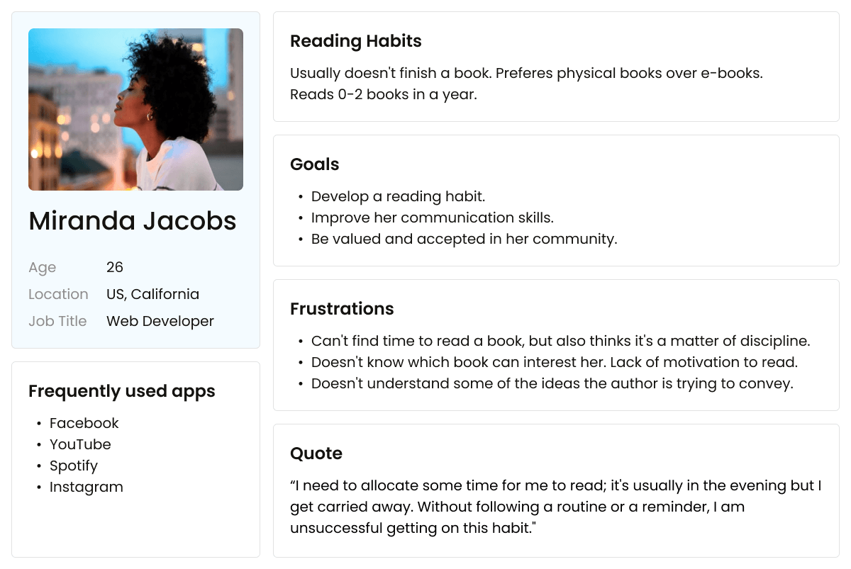
These are usually archetypal fictional users whose goals and characteristics represent the needs of a specific target user group. By creating one or a few user personas, you can gain a more nuanced understanding of your target audience, including their needs, behaviors, and preferences. This information can then be used to create targeted design user flows and interfaces.
Helpful resource: User persona template

Outlining user stories
User stories are a concise way to capture the users' interactions with the future product. They describe a feature from the user's perspective in a brief, plain-language way.
User stories contextualize the app’s functionality so that designers can better understand how the end user will benefit from a given feature. These usually come in short yet informative sentences such as “As a [user], I want to/can [goal to achieve] to <receive value>.”
Helpful resource: Storyboard template

Mapping user journey
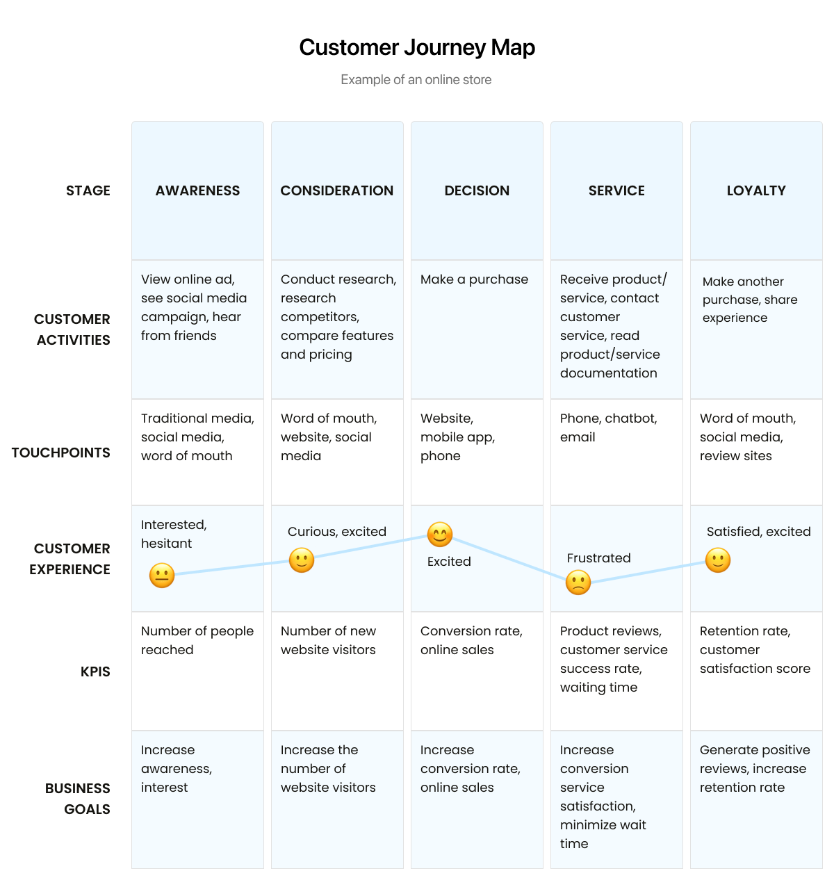
Now it’s time to bring our user personas into a cohesive whole with the product interaction process. Customer journeys are visual storylines that describe the app touch points the end-user goes through, as well as problems they may face using your future product. These maps can be simple or complex based on the level of detail you’re aiming to describe.
Helpful resource: Customer journey map template

Establish application structure
After you and your team have all the vital insights on your hands, it’s time to go over the application design. Here, the application structure will define the user interaction, application behavior, and content layout. The process of designing an app can be divided into two stages.
Interaction design
This design component encompasses a broad range of user-product elements that help end users achieve their goals. Interaction design is also commonly defined as “the goal of creating products that enable the user to achieve their objective(s) in the best way possible.”
Simply put, interaction design helps design teams examine and define the interactions between the system and the user to improve the app's usability. Interaction design typically stems from a combination of user behavior, time, physical space, graphical elements, and content.
Helpful resource: Flow chart template
Information architecture
As the name may imply, information architecture helps organize and structure content. It lays out the location of elements or content to make them easily discoverable for users.
A thought-out information architecture should be flexible and adaptable to new content. It can either remain at the structure level or be more detailed when describing each element.
Helpful resource: Information architecture diagram template
Build wireframe
Wireframes are essential during the app design process; these are low-fidelity sketches that depict the layout of a website, app, or other product. By creating wireframes, designers can establish a visual hierarchy, determine UI elements and how they will interact, and explore user flows.
Usually, wireframes include a visual display and arrangement of interface elements, content, and navigation based on collected data from previous stages. For designers, these sketches help create the final layouts of the application design. Also, wireframes help speed up the development process by allowing stakeholders to get on the same wavelength before moving on to high-fidelity mockups.
We recommend using Figma or Axure RP for building wireframes.
Take care of UI design
Once the wireframes get your approval, UI designers step in to bring an aesthetic to your application. At this stage, UI designers decide on the color palettes, typography, and graphics, and they study the main UI elements of the interface. Remember, UI design is always based on the project vision you established during previous stages.
By this time, your UI team should also have a few application concepts for you to choose from. Once you select the best option, the team will develop a style guide that provides guidelines on the product's user interface to build your UI consistently.
Helpful resource: Spectrum – Figma plugin and web app for generating color palettes.
We recommend using interface design guidelines from Apple (for iOS apps) or Google (for Android apps) if you do not have a budget allocated to testing your design hypotheses. These guides increase your chances of creating a compelling interface for your end user, in line with the requirements of app stores.
Send designs into development
At this stage, the designer creates the final layouts, which will later be presented to the development team. The final layouts should be as detailed as possible, covering all screens in their various states.
For example, your design team should include a display of an empty news feed post-registration or ‘incorrect password’ messages. Also, if the application displays articles, designers should include examples of long and short headlines.
Tools like Figma allow your team to create interactive prototypes that mimic the behavior of a future application. By creating interaction layouts, you can prevent the appearance of undeveloped screen states. They also expose your user flow to additional testing and help your team run final tests.
Spice it up with animation
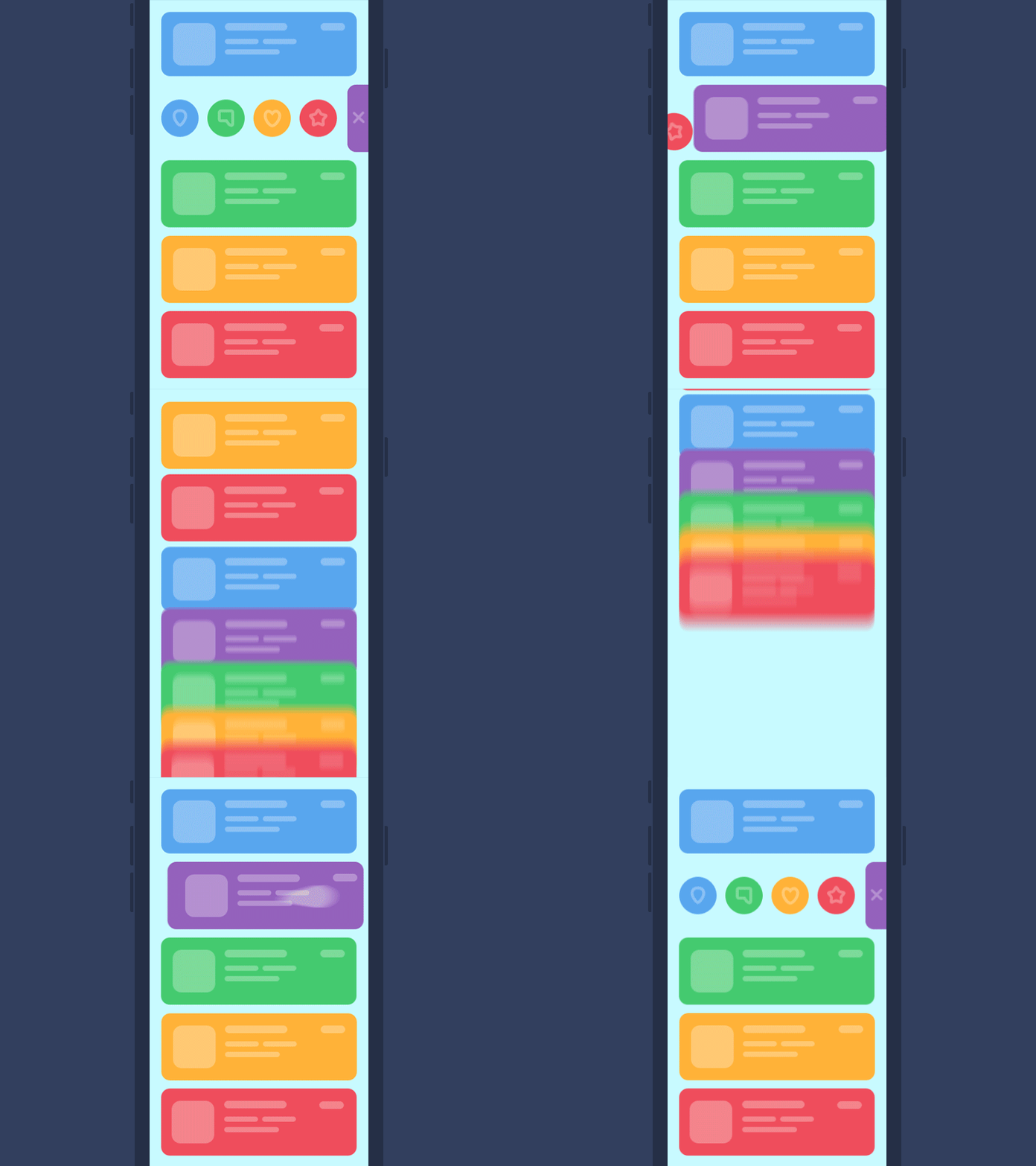
User interface animation is a must-have ingredient of modern visual products since it makes mobile apps more interactive, dynamic, and intuitively understandable. From a tech standpoint, UX animation is the process of adding motion to the interface to improve the usability and satisfaction of a user's interaction with a product.
Animations can be used to explain how a product works, guide a user through a task, or make the waiting time more tolerable. More interactive mobile applications also help reduce cognitive load, which is especially useful for educational applications.

Other benefits of animation include:
- Increased usability – dynamic pieces help provide key context and prevent users from getting lost;
- Originality – when animations combine emotions and storytelling, users can be enticed further into the digital solution
- Convenient, easy interaction – animated elements can be used to make transitions more obvious
- Multitasking – animations can fulfill several functions simultaneously
- Faster interaction process – animated scrolling allows the user to jump to a new position on the same page
- Clear feedback – visual feedback reduces uncertainty and creates necessary expectations.
Animation includes screen animations, onboarding flows, animated log-ins, and explainer blocks. Therefore, designer teams may resort to various tools to dress up their solution.
Next, let’s look at the usual suspects found in our toolbox when building engaging animations for your mobile applications.
Adobe After Effects
After Effects is the gold standard for creating visual effects and motion graphics. It is one of the most-used animation software programs that empowers both simple and detailed, sophisticated motion graphics animation. Packed with robust functionality, After Effects is our favorite tool for 2D animations.
Figma
Figma is another software masterpiece with a less steep learning curve than After Effects. It is a flexible, cloud-based tool with built-in functionality to quickly turn Figma designs into advanced animations. Structural animation, push animation, and button interactions are just a sliver of Figma’s capabilities.
Framer
Framer's animation library is also sufficiently powerful, with Framer Motion fuelling production-ready animation. Framer Motion is mainly associated with React and is often used for quick prototyping. As for animations, Framer is great for simple animated elements, transitions, and motion animations.
Principle
Principle is a lesser-known prototyping tool for animated designs with a Mac-friendly interface. The tool’s timeline allows designers to tweak the bounce, ease, and pop to a tee as well as experiment with different interactions.
And don't forget post-launch research
Even after successfully launching your mobile app, the design work is far from over. Your design team should invest time in post-launch production to ensure that the final product hits it off with the end user.
Post-launch research is a type of market research conducted after a fully designed product has been released to consumers. This research evaluates a product's market performance, assesses customer satisfaction, user engagement, and identifies potential improvements using established metrics.
Post-launch initiatives also help identify unmet user needs that could be addressed in future product releases. By understanding what resonates well with customers and what could be improved, businesses can make informed strategic decisions about their mobile applications.
Among the most popular post-launch research methods are:
A/B testing
A/B testing, also known as split testing, is a scientific method of testing changes to a digital product. Here, designers present two or more design features to the user to test them against each other. A/B testing can be used to test anything from the color of a button to the text on a page.
Usability studies
This research refers to evaluating a final product by testing it with representative users. In this case, real users are asked to complete a list of tasks so that the researchers can see weak points or ill-timed interactions. If the same problem is valid for most users, designers will schedule updates to eliminate the issues.
Surveys
After your team has wrapped up a launch, your designers may also suggest that the end users answer a few questions. For instance, surveys can include a set of design questions about a specific feature. Based on user feedback, your team will plan further design improvements as needed.
Log analysis
This research method also provides useful metrics for further enhancements by capturing recordings of users interacting with your mobile applications. This way, UX/UI designers can see how the users interact with the app first-hand and pinpoint potential stumbling blocks that need perfecting.
The bottom line
Mobile app design embraces the non-linear nature of design thinking. Unlike pure science with fixed constants, design is typically a blend of art and science, with more variables in play. That's why there is no fixed formula for the design process; steps may vary depending on the unique nature of your project.
The common thread across all design processes is their focus on understanding user needs. Through continuous research and iterative refinement, you ensure your product constantly evolves to meet those needs.
Ready to create an app that resonates with your target audience? Our team of experienced app designers can help you navigate the design process, translate user needs into intuitive interfaces, and bring your app vision to life. Reach out to our team to get a free estimate for your project.
