

As a full-cycle healthcare software development company, we feel the weight and responsibility that comes with healthcare UX. Healthcare application design differs fundamentally from consumer applications because interface failures can directly impact patient safety and clinical outcomes.
It’s not about sleek interfaces, pretty pixels, or smooth flows. A good healthcare user experience is about making sure a nurse can access critical information in seconds, a patient doesn’t feel lost in medical terminology, and a doctor doesn’t spend extra time entering data when they could be saving lives.
Because in healthcare, clarity isn’t a luxury — it’s a lifeline.
Key takeaways
- Legacy tech still rules healthcare, and it's a UX mess. EHRs and third-party platforms are fragmented, inconsistent, and outdated.
- Compliance and accessibility are now mandatory, not optional. ADA, WCAG 2.2, HIPAA, and the 21st Century Cures Act shape modern UX.
- Good UX can reduce delays, stress, and even clinical risk. From emergency settings to device monitoring, clarity isn’t cosmetic — it’s critical.
- Patient-centered design needs real patients involved early. Co-designing with users avoids top-down assumptions and builds lasting trust.
- 2026 trends: predictive UX, voice-first design, emotion-aware interfaces, ambient monitoring, and interoperability-centered flows.
Current state of UX in healthcare: it’s not there yet
The healthcare industry is doing its best to digitize. But due to the legacy technology burden, regulatory guardrails, and multi-stakeholder environments, healthcare digitalization is not keeping pace with the human needs behind the screens.
Fragmented digital experiences across platforms
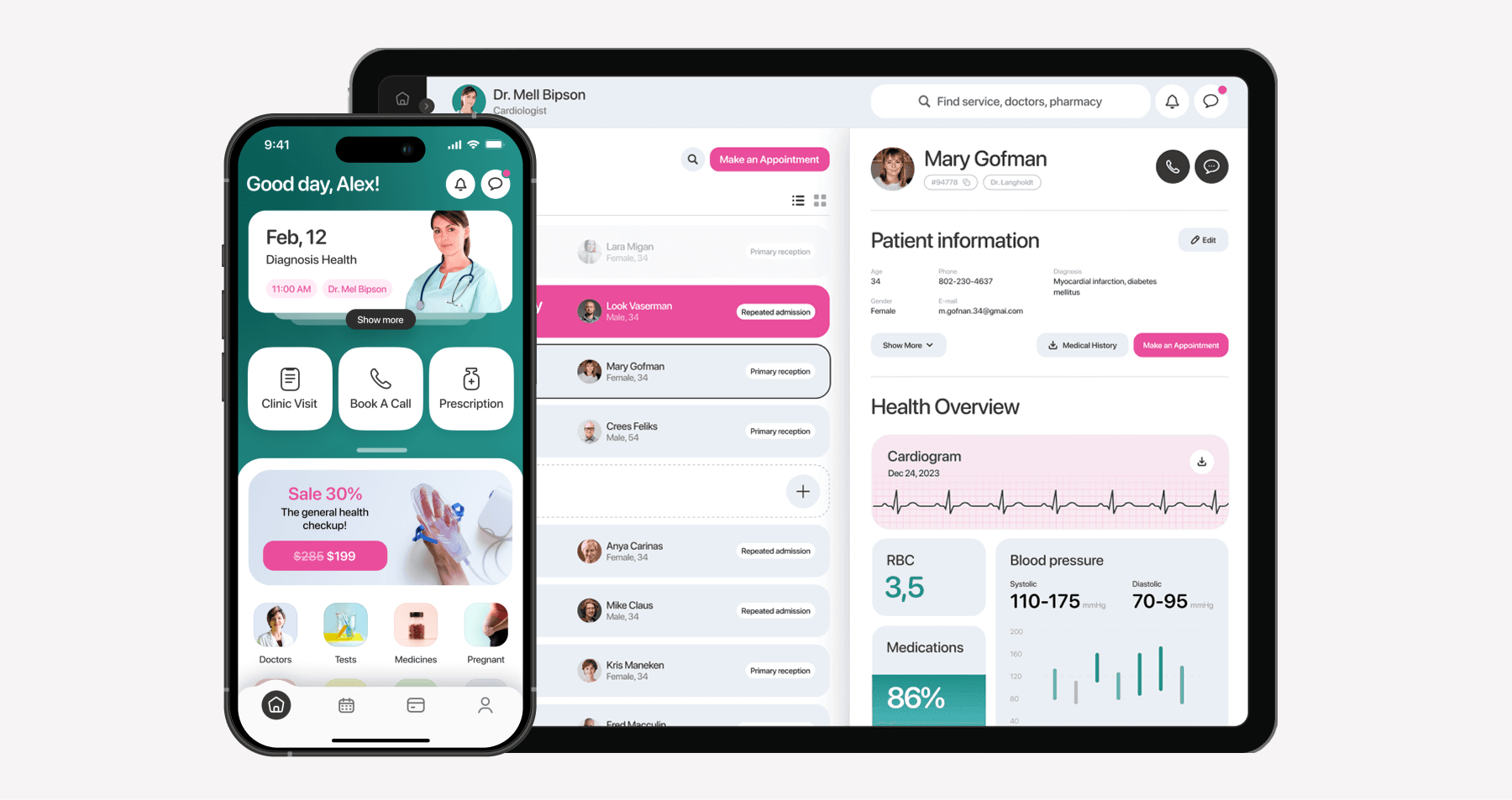
A typical tech estate in healthcare is patched from legacy software, third-party systems, and new digital tools that don’t always speak the same language. As a result, users encounter inconsistencies when transitioning from billing systems to a patient portal and struggle to navigate the applications.
Healthcare providers, more than anyone else, have to toggle between different systems, log in countless times, and fill in the same data. Patients also have their fair share of UX chaos because their experience is often just as disjointed. They might schedule appointments in one app, access results in another, and communicate elsewhere.
The gap between clinical utility and user experience
First and foremost, healthcare systems are designed to be functional. However, visually dense and navigated, typical EHR systems look like they time-traveled right from the early 2000s. Also, when hospitals use customized builds, the system’s UX looks like a dozen different apps stitched together across modules.
To be fair, EHRs support a myriad of workflows, work closely with the rest of the healthcare digital estate, and meet regulatory requirements such as HIPAA and ICD-10. So, their complex look and feel is partly justified. But it doesn’t make them easier to navigate.
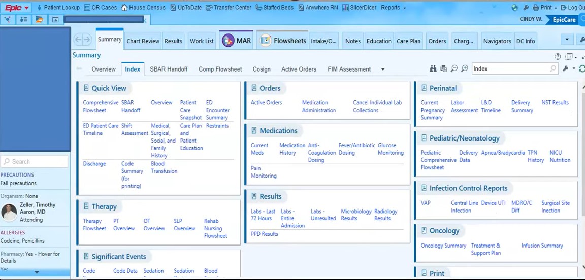
Newer digital health tools take notes from consumer tech and generally have a better UX compared with the long-time software staples. But still, they exist alongside healthcare tech relics that were never designed with a UX mindset.
Increasing regulatory pressure for accessible design
EU Accessibility Act (EAA), Americans with Disabilities Act (ADA), Section 508 of the Rehabilitation Act, 21st Century Cures Act (US), and other regulations are turning accessible designs from a nice-to-have to a legal mandate with teeth. Many healthcare companies got hit by accessibility lawsuits because their websites or digital tools don’t effectively cater to users with disabilities.
WCAG 2.2 AA, although not yet mandatory, is also becoming a de facto standard for healthcare tech startups and healthcare companies — a trend we’ve noticed across our recent projects. But despite the legal liability, mainstream accessibility is still a far-off goal, as many healthcare organizations settle for “good enough”.
Key UX challenges in healthcare and tried-and-true ways to steer them
Over 50 projects later, we understand that UX challenges in healthcare aren’t really challenges. They’re crisis friction points, because every healthcare UX flaw can end up being a delay in care or a safety risk. Also, they are systemic, as many don’t stem from bad design alone, so there’s no easy way to address these issues. Anyway, below we’ve broken down the most significant challenges our healthcare clients face and how we usually solve them.
Designing for different sides of care at the same time
It takes about five stakeholders to execute a single medication order. Each of these stakeholders, including healthcare professionals and patients, approaches healthcare applications with radically different mental models. So designing a UX that centers on the diverse needs of all five stakeholders challenges development teams and makes them prioritize the needs of one user group over another.
The most obvious and resource-intensive solution would be optimizing every screen for every role. What we suggest is creating a shared mental model of care for a product and identifying where handoffs happen between the stakeholders. This way, instead of designing different screens for each user group, a team can bake in role-sensitive displays that adapt the same data to each stakeholder’s needs.
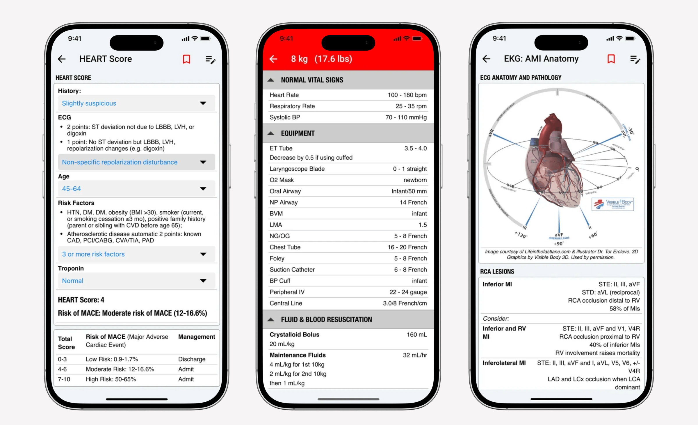
Cognitive load and information overload
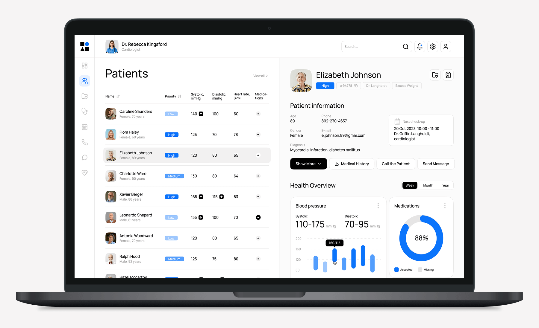
Healthcare products often try to fit and surface everything from patient data to lab results and medication lists. And in most cases, data visualization is not the main problem. It’s the sheer volume of detailed data and the visual hierarchy that prevent a doctor from immediately identifying abnormal lab values or medication conflicts.
When we were designing a virtual care platform for a U.S. hospital, visual hierarchy was something our healthcare UX designer kept front and center. We broke down complex medical information into clearly segmented cards and ensured that emergencies were clearly visible against the bright pink color. We also made timeline views and patient switching intuitive and seamless, so doctors can context-juggle while keeping their focus.
Accessibility beyond traditional standards multiplied by compliance requirements
When developing for the healthcare sector, one often has to balance accessibility standards like ADA with compliance mandates like the Health Insurance Portability and Accountability Act. Oftentimes, designers end up retrofitting UX onto the compliance scaffolding of the product because compliance and robust security measures are given higher priority.
For example, HIPAA compliance may require robust data security measures, like two-factor logins for sensitive data. SMS-only logins or complex password requirements exclude users without smartphones or users with visual impairments.
To ensure accessibility is not an afterthought, our UI/UX team incorporates it into the design foundation and collaborates with compliance experts from the start. This way, we use compliance as creative guardrails and create user-centered design around them.
As for accessibility-focused design, adherence to standards such as WCAG and ADA is not enough to deliver truly inclusive experiences that improve patient care. Healthcare designers need to test early with real users, especially older users, individuals with disabilities, and those with limited access to technology, to uncover edge cases and validate their assumptions.
Slipping into dark UX in sensitive contexts
When healthcare applications pressure users emotionally with phrases like “you’re losing your 30-day streak” for the sake of improved DAUs or use red alerts to notify users of minor shifts in biometric data, they can cause unnecessary stress among vulnerable users. In mental health support apps or fertility applications, this kind of pressure can feel manipulative and lead to physiological consequences.
Urgent language, fake countdowns, and other dark UX patterns are a big no for sensitive, often high-risk healthcare applications. Design choices in this space should be guided by emotional safety principles:
- Adopting transparency as a feature — Instead of throwing opaque scores and phrases at the users, a healthcare app should explicitly state how this data is generated (e.g., “Your stress score is calculated based on your heart rate trends and self-reported mood logs”).
- Stating the app’s limitations — Warnings like “the app does not replace a doctor’s diagnosis” prevent users from overrelying on applications and stressing about the results.
- Empowering users without stressing them into doing things — Instead of going with aggressive calls to action, make sure the language stays reassuring throughout the app.
- Allowing users to adapt the intensity and frequency of feedback — Users should be able to choose between daily/hourly notifications.
Designing for moments of stress
Healthcare solutions often support medical professionals in high-pressure situations, like ER departments or intensive care units. Here, UX may become a safety issue, so it plays a crucial role. That’s why designers have to think through every tiny detail, button, and cue to make sure users can access necessary health data or patient information in a matter of seconds.
In these contexts, cognitive load is immense, and the time is ticking. Here are a few tips that help our UI/UX design team prepare the application for such environments:
- Designing for cognitive load — Our designers use a clear visual language, intuitive spatial layouts, task-focused flows, and universally recognizable icons to ensure at-a-glance comprehension in time-sensitive scenarios.
- Removing extra friction — It should take a user a minimum number of clicks, swipes, and mental number-crunching to finish the tasks. Modals, accordions, and deep menus should be reserved for less emotionally charged applications.
- Designing for error — Building in room for mistakes and easy ways to recover from them is vital in high-stress environments. That’s why we usually incorporate undo options and clear confirmation steps for high-impact actions.
- Validating under stress conditions — Nothing validates interfaces better than hardcore usability testing in contextually relevant scenarios.
Designing healthcare apps that are tied to medical devices
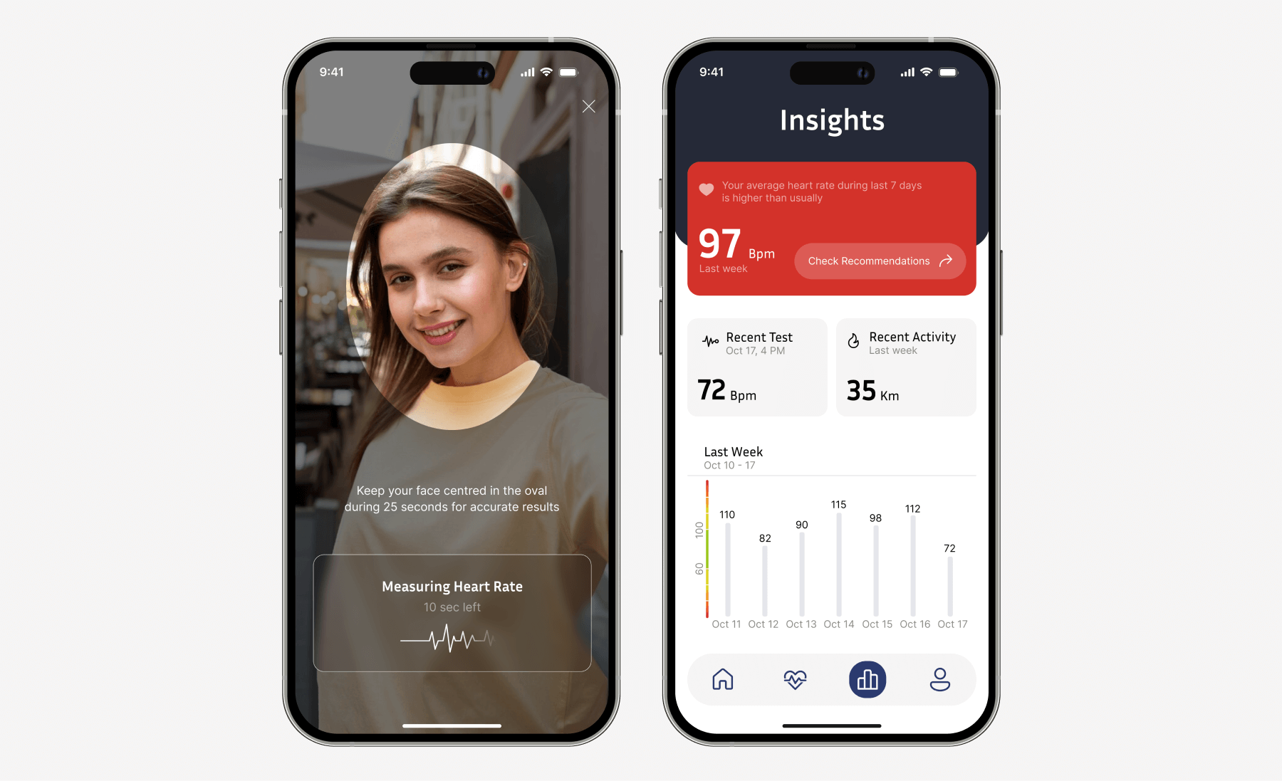
CGM apps, EKG applications, and other healthcare apps that pair with medical devices fall into a separate UX category because of their focus on medical data presentation. These apps deliver complex, clinically important patient health data that comes in continuous streams. From a UX point of view, it means that the app’s interface must do its best not to overwhelm users with data while also keeping it medically accurate.
To achieve that effect, designers visualize data and give users some context behind the actionable insights. For example, a CGM app shouldn’t just display a blood glucose value but explain whether that number falls into a safe range and what the user should do next if it doesn’t.
The numbers displayed should not only be contextually rich but also calmly delivered, without overly aggressive alerts or ambiguous symbols. Such apps need to focus on real-time reassurance.
Another important component is device status visibility. As these apps work in tandem with hardware, there’s a chance the device can disconnect or run out of battery. The app must put this information on a sharp display so that the user doesn’t waste time digging through hidden settings.
Setting up feedback loops in healthcare UX
When it comes to the post-launch life of digital healthcare solutions, designers and developers often lose insight into how the product holds up over time. Many development teams count on NPS (Net Promoter Score) or generic surveys to gather user feedback. Often, these feedback mechanisms are not seamlessly woven into clinical workflows or emotional states, which renders them ineffective.
But without ongoing, intentional feedback, the UX can decay and fall behind the users’ needs. Micro-feedback mechanisms that are lightweight, take under 10 seconds to fill out, and are embedded into the natural flow of the user experience will be a more effective way to check in with the users.
UX trends defining healthcare in 2026
Although the healthcare technology is mainly playing catch-up with other more tech-savvy industries, it’s still advancing at its own pace. The same goes for healthcare design: digital health startups and pioneering healthcare organizations are doubling down on patient-centered experiences, improving patient engagement and patient outcomes. Looking at the healthcare UX trends, we can already see that the future is anticipatory, ambient, and seamless at last.
Predictive UX powered by AI
Unlike static interfaces, predictive UX evolves together with user behavior and needs. In healthcare, this capability is potentially life-saving because an application can proactively, but gently, pitch in with well-timed nudges when it matters. For example, diabetes management apps can send a "your glucose is trending low in 2 h" notification and suggest a snack.
Powered by AI, these interfaces have a deep understanding of the user’s past behavior, biometrics, medical history, and other data. They can improve diagnostic accuracy, enhance treatment adherence, and ultimately, improve patient outcomes.
According to Teladoc’s research, timely, personalized health tips in a diabetes management program can lead to a 3X increase in patient engagement, leading to an additional 0.4 reduction in A1c (8.2 to 7.8).
Voice-first and touch-free interfaces
Compared to regular UX, voice interfaces enable users to interact with healthcare technology more naturally, through speech and gestures. Touch-free user interactions lend themselves well to high-pressure, hygiene-conscious environments. For example, in operating rooms, surgeons can use hands-off voice assistants like Orva Health to access patient records or medical imaging.
In patient care, voice assistants can help elderly or mobility-impaired individuals manage their care, including appointment scheduling, medication management, or health information access. Using voice-operated AI companions like ElliQ, seniors can age in place independently, taking care of their physical and mental health with minimal external assistance.
Emotion-aware interfaces
Emotion-aware UX fuses data streams from biosensors such as heart rate variability (HRV), galvanic skin response (GSR), and facial expression tracking to look into the user’s emotional state in real time. If a user is showing signs of anxiety, the application may fine-tune its visual design, language, and content delivery.
In telehealth services, empathetic interfaces can watch for vocal tension or micro-expression to detect moments of distress — so that clinicians can respond more thoughtfully and with greater timing.
Human-digital co-design with patients
These days, it’s more about healthcare companies being more likely to develop patient-facing interfaces in a vacuum or through post-factum hypothesis validation. Leading with the traditional top-down design, the development team gathers user requirements and then tests the usability of a nearly full-fledged product.
While this approach isn’t inherently bad, using it to develop complex healthcare products, such as chronic disease management solutions or software as a medical device system, can lead to a myopic view of real user needs.
Conversely, a participatory design model brings patients into the fold early and throughout the entire development process as active collaborators. This way, development teams can build upon firsthand patient experience, whether it’s daily routines, emotional burdens, or accessibility changes, to deliver truly inclusive and patient-centered experiences.
Interoperability-centered UX
Because of fragmented workflows, dated software, and uneven standards adoption, digital solutions lack data fluidity across software and care contexts. It means that each time patients or clinicians move between care settings, critical data is lost during transitions or takes some time to catch up, which causes critical delays in care and creates mental friction points.
Interoperability-focused UX leverages a combination of FHIR-native interfaces and modular UX principles to pull data from target systems in real time, making sure that UI components work uniformly across systems. UI, in turn, adapts based on available data — showing or hiding relevant fields based on what’s coming from connected systems.
For patients, this interconnected interaction will add to the seamless care journey across devices and platforms, while clinicians can reclaim the time they now spend on duplicate entry. From a tech perspective, this approach will require a component-based architecture and FHIR integration layers that will allow applications to communicate with the rest of the digital estate.
Invisible UX in ambient real-time health monitoring
What can a room do for patients? If it’s equipped with zero-UI ambient intelligence, it can monitor a patient’s health inside and outside healthcare settings without any conscious effort from the user. Ambient intelligence is powered by unobtrusive sensors that blend into the decor (like the ones by Aqara and Zoe Care) to keep tabs on patients, detect falls, or deviations in daily routines.
Instead of relying on tangible UX, ambient health monitoring turns the entire environment into one big device-agnostic sensor that interprets data contextually and triggers alerts only when necessary. Users get fewer notifications, less noise, and care embedded into the fabric of daily life.
Final thoughts
“Design for the worst day of someone’s life, not just the best” is a motto we stand by when designing user-friendly interfaces for healthcare services. In medical care, it doesn’t matter how advanced the cutting-edge technology is or how sleek the design is behind it. If the UX is not intuitive, accessible, clear, and supportive, it can fail users in critical situations when mistakes are the most costly.
If you need a thoughtful healthcare experience that not only supports better systems but also advocates for better care, our UX professionals can help your company achieve this goal. Thanks to our 15+ years of experience in healthcare software and our custom accessibility-focused design and development process, our team delivers software that is truly usable in real life, by real people, under real stress. Contact us if you need one.